New to Graphic Design? Avoid These 5 Beginner Mistakes
Introduction
Hey there! Are you a designer or someone curious about what makes design great? Whether you’re just starting or have been designing for a while, there are some common mistakes many designers make. These mistakes can slow down your progress or keep your work from looking its best. The good news? Once you know what they are, you can avoid them and become a better designer fast!
Today, we’ll talk about the Top 5 mistakes every designer makes often, why they happen, and simple ways you can fix them. This guide is perfect for beginners, students, or anyone who loves design. Plus, it’s packed with easy tips that even a 10-year-old can understand. Let’s dive in!

Ignoring the Power of White Space (Negative Space)
What is White Space?
White space is the empty area around and between elements in your design. It’s not always white — it can be any color — but it’s space that gives your design room to breathe.
Why Do Designers Ignore It?
Many new designers think they need to fill every inch of their canvas with pictures, text, or color. They worry empty space looks like wasted space. But that’s not true!
Why is White Space Important?
It makes your design look clean and organized.
It helps people focus on the most important parts of your design.
It improves readability and makes your work easier on the eyes.
How to Fix This Mistake?
Don’t cram too many things together.
Use margins and padding between text and images.
Step back and ask yourself: Does this design feel crowded? If yes, add more white space.
Example: Look at top websites like Apple or Nike — they use lots of white space to make their products stand out.

Using Too Many Fonts at Once
Why is This a Big Problem?
Fonts are like voices in your design. If you use too many different fonts, your design can look messy and confusing.
What Happens When Designers Use Too Many Fonts?
The design loses focus.
It looks unprofessional.
It’s hard to read and understand.
How Many Fonts Should You Use?
Most professional designers stick to 2 or 3 fonts max. Usually, one font for headings and one for body text works best.
How to Choose Fonts That Work Together?
Use font pairs that complement each other. For example, pair a bold, strong font with a simple, clean font.
Avoid fonts that are too similar.
Use easy-to-read fonts for long paragraphs.
Quick Tip:
Google Fonts is a great free tool where you can find font pairs already tested by experts.

Not Paying Attention to Color Contrast
What is Color Contrast?
Color contrast is the difference between the colors you use in your design, especially between the background and the text.
Why Do Designers Make This Mistake?
Some designers choose colors because they look nice together but forget to check if the text is readable on the background color.
Why Does Color Contrast Matter?
Poor contrast makes text hard to read.
It can make your design look unprofessional.
It affects accessibility, meaning people with vision problems might not be able to see your design clearly.
How to Fix It?
Use tools like the WebAIM Contrast Checker to test color contrast.
Stick to dark text on light backgrounds or light text on dark backgrounds.
Avoid using colors that are too close in brightness or hue.
Bonus:
Use color contrast to guide your viewer’s eyes to the most important parts of your design.

Forgetting to Plan Before Starting
What Happens When Designers Skip Planning?
Jumping right into designing without a plan is like building a house without a blueprint. You might waste time, materials, and end up with a design that doesn’t work well.
Why Do Designers Skip Planning?
Sometimes designers get excited and want to start creating right away. They don’t realize how important it is to organize ideas first.
What Does Planning Look Like?
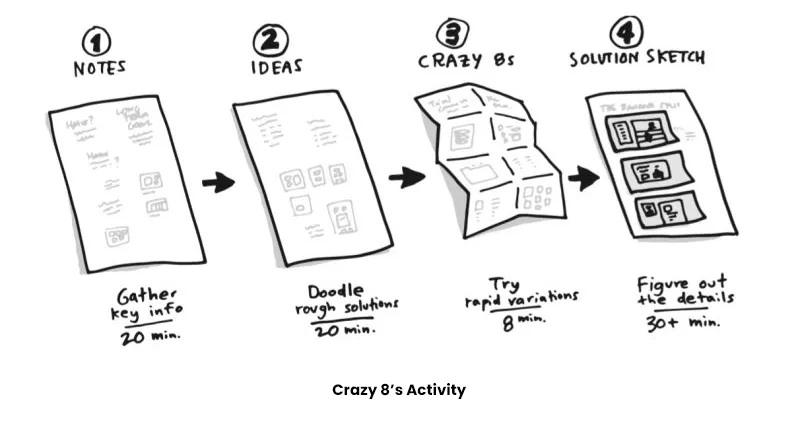
Sketching rough ideas on paper.
Creating a mood board with colors and styles you like.
Writing down what the design’s purpose is and who it’s for.
Listing key elements you need (like logos, text, images).
How Can You Start Planning?
Take 10 minutes before you start designing.
Use simple tools like Pinterest or Canva mood boards.
Talk to your client or think about the audience.
Why Does Planning Help?
Saves time by avoiding redesigns.
Makes the final design clearer and stronger.
Helps you stay focused on the goal.

Overusing Effects and Filters
What Are Effects and Filters?
Effects are things like shadows, glows, blurs, and filters that change how an image or text looks.
Why Do Designers Overuse Them?
Many designers think that adding lots of effects will make their design look cooler or more professional.
What’s Wrong With Too Many Effects?
It can make your design look cluttered.
The message gets lost in the visual noise.
It can distract people instead of helping them understand the design.
How to Use Effects the Right Way?
Use effects sparingly and only to highlight important parts.
Stick to subtle shadows or simple highlights.
Always ask: Does this effect help or hurt the design?
Pro Tip:
Look at professional logos or websites — most are clean and don’t rely on heavy effects.
Bonus Tips to Become a Better Designer
Ask for feedback: Show your work to friends or other designers and listen to their advice.
Keep learning: Design trends change fast, so keep reading blogs, watching tutorials, and practicing.
Practice patience: Good design takes time. Don’t rush your work.
Use tools wisely: Programs like Adobe Photoshop, Illustrator, and Canva are powerful. Learn their basics well.
Conclusion
Design is a fun and creative job, but it’s easy to make mistakes — even the best designers do! The five mistakes we covered here are very common but super easy to fix once you know about them.
Remember to give your design space to breathe with white space, keep fonts simple, check your colors for readability, always plan your work, and don’t go crazy with effects. Follow these tips, and you’ll see your designs improve right away!
If you want to dive deeper into design tips or need help on a project, just ask. Happy designing!
Did you find this helpful? Share it with your friends or bookmark it for your next design project!
